Homage to the Square: Departing from Yellow
Colour has a profound effect on our lives; on our mood, the train of our thoughts, our mental associations, our outlook. When we see a tone or combination of tones, a mental and/or physical reaction occurs on some level, the trigger of which be a hugely varied and complex thing. As children, we have favourite colours, but these preferences don’t always endure, perhaps because our reasoning develops. As adults we make colour selections on a daily basis, some may be considered and significant, while others are (apparently) not given any thought at all. There are temporary choices such as the clothes we wear or the colour counter we choose in a board game. More permanent selections like the colour of a car we buy and the paint we put on the walls of our homes usually require careful decision-making. Reasons for the above may include the weather, our present frame of mind, practicality or functionality.
Shades can complement harmoniously or clash, induce calm or activity, create interest or produce a jarring effect on the viewer – red and pink together does this for me. Tones can vibrate against one another, giving an illusion of movement or depth. We can think in colour (though the mind cannot replicate it very accurately) and some even experience it mentally in a form of synesthesia. Colour blindness means that some see certain tones as another colour altogether. Some people have an ‘eye’ for colour. Colour has value, sometimes shared culturally (red and green for Christmas, that specific Cadbury’s purple), associations which are used and exploited for marketing purposes. These values can also be applied to either affect our perspective in an environment or to have it reflect certain thoughts onto us. Think of neutral tones in doctors surgeries and classrooms, bright and bold in theatres and gyms. Knowing these connotations can be useful for manipulating perception, thoughts and behaviour, and painters have done this for hundreds of years, namely through symbolism.
Josef Albers was a painter, furniture designer, stained glass maker and Bauhaus teacher. In 1963 he published Interaction of Colour containing his theories on ‘an experimental way of studying colour and teaching colour’. Today it is regarded as a key textbook for artists, designers and educators in the arts. In the book, Albers breaks down how we both observe and experience colour, giving instructions for applying tone articulately and with the aim of a desired result. He wrote about the ‘discrepancy between physical fact and psychic effect’ when we observe tones, and examined how this can be manipulated to deceive our perception through how the colour is presented to us. Although his own work can often be abstract in a seemingly severe way, it is infused with a power and freedom that elevates it from something of purely clinical design.
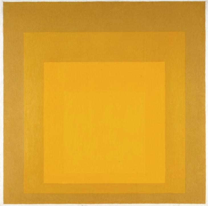
This painting is from the series Homage to the Square, which preoccupied him for 26 years. During that time he created hundreds of variations based on the same formulaic layout of squares. By repeating the same structured and elegant template over and over allowed he was able to demonstrate in an almost scientific way how varied the outcomes could be just by changing the colours. ‘They all are of different palettes, and, therefore, so to speak, of different climates’ wrote Albers, ‘Choice of the colours used, as well as their order, is aimed at an interaction – influencing and changing each other forth and back.’ The squares are ordered by size, they are straight and layered in a pleasingly graphic way, with the bottom lines of the squares all equidistant. There is no texture, or what Albers called ‘hand writing’, but the shades of yellow interact in such a way that the painting does not appear flat. In this version, Study for Homage to the Square: Departing in Yellow (1964) we are invited to envelop ourselves in pure tone and form. Albers saw his purpose as an artist to make people rethink what they were seeing, encouraging the viewer to put their own thoughts onto his paintings, allowing for a uniquely personal and almost psychological reading.
As I look at the image of this on the screen the outer browner yellows -Naples Yellows – are quite drab and brown. Somehow they are colours that are ‘dated’, reminiscent of things from the 60s; knitted mustard tank tops and vintage floral wallpaper. The two inner yellows – Pure Cadmium yellows – are different though. They have a warmth and golden luminosity, which was appreciated by painters like van Gogh and Matisse. It is in this central square, the only one that we see whole, that the eye has space to delve. This painting is like an ode to yellow, or a symphony. The orderly gradation of tone (not applied in all of his Homage to the Squares) is satisfying. Despite the absence of any dimension, there is an illusion of depth. In a strange optical trick, I see a tunnel which recedes into the painting like an old-fashioned folding camera. Albers mastered colour through methodical practice rather than the traditional symbolic values of it, forging a new theory-based way of thinking and using it in art. He wrote “I have said to my students ‘I am putting you into a vacuum and asking you to breathe'”, and that is the reward for those who take the time to properly look at his work.